



How Visualization Helps Designers Turn Ideas Into Emotion
A designer rarely begins with furniture alone. They begin with a feeling: calm, warmth, softness, drama, intimacy, openness, stillness. The challenge is not just creating that feeling — but helping someone else see it before the space exists.
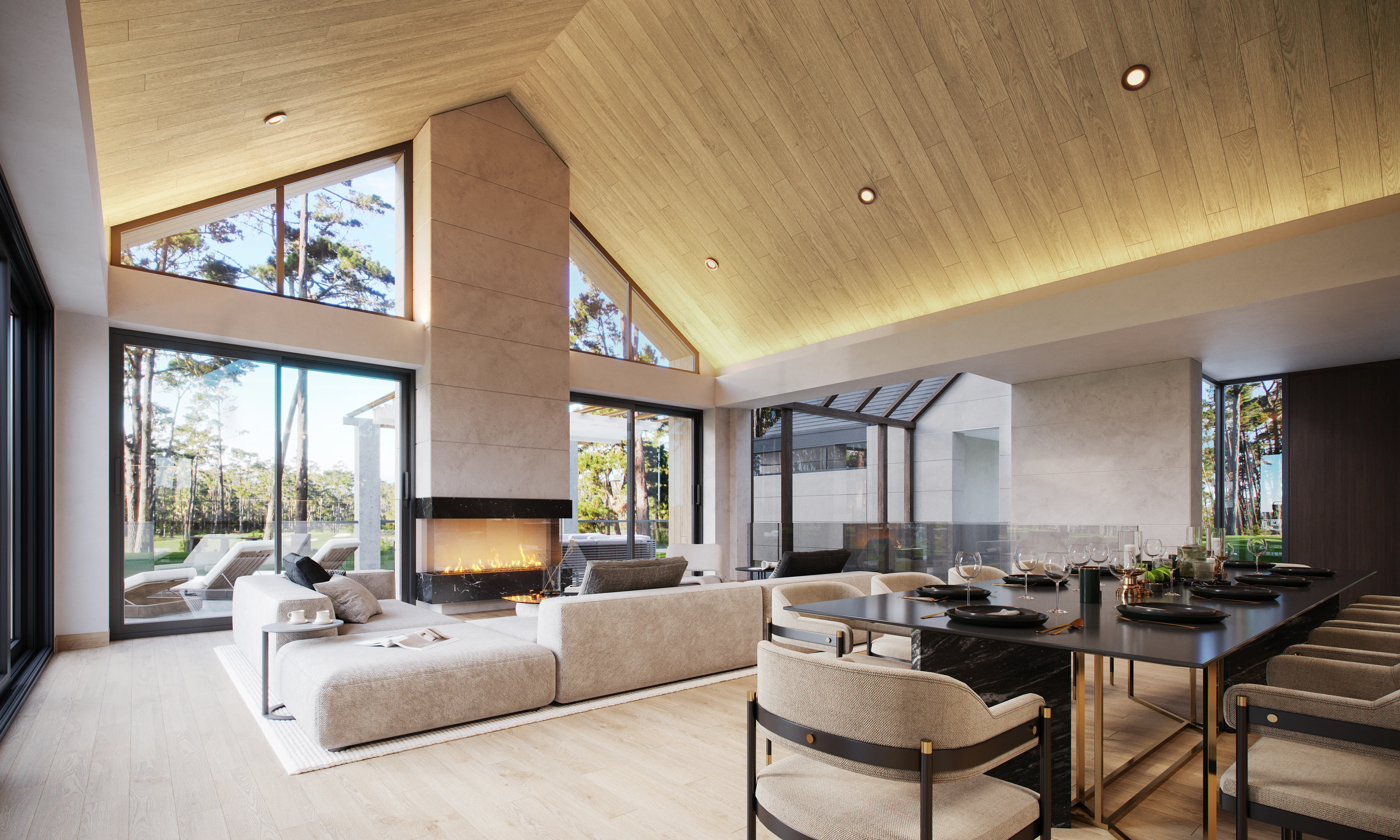
Design Begins as Feeling Before It Becomes Form
Most conversations about interior design focus on the visible outcomes: the palette, the furniture, the finishes, the way a room photographs. But the process that produces those outcomes almost never starts there. It starts somewhere less tangible — with a quality of light a designer noticed in an old building, a texture that felt unexpectedly soft underhand, a memory of a room that was difficult to leave. The emotional direction of a project is often established before a single product is specified.
This is not sentiment. It is design logic. A room that is meant to feel calm requires different proportions, different material weights, different lighting treatments than a room meant to feel alive with energy. A bedroom designed for deep stillness and a living room designed for warmth and social ease begin from different emotional premises — and those premises shape every decision that follows, from ceiling height to the reflectance value of the floor.
Designers think in mood before they think in objects. They work with tension and softness, with openness and enclosure, with the contrast between a rough surface and a smooth one, with the sensory atmosphere that accumulates when specific materials and light conditions meet in a particular spatial arrangement. The emotional character of a space is not an afterthought added to a functional brief. In most meaningful interior work, it is the brief.
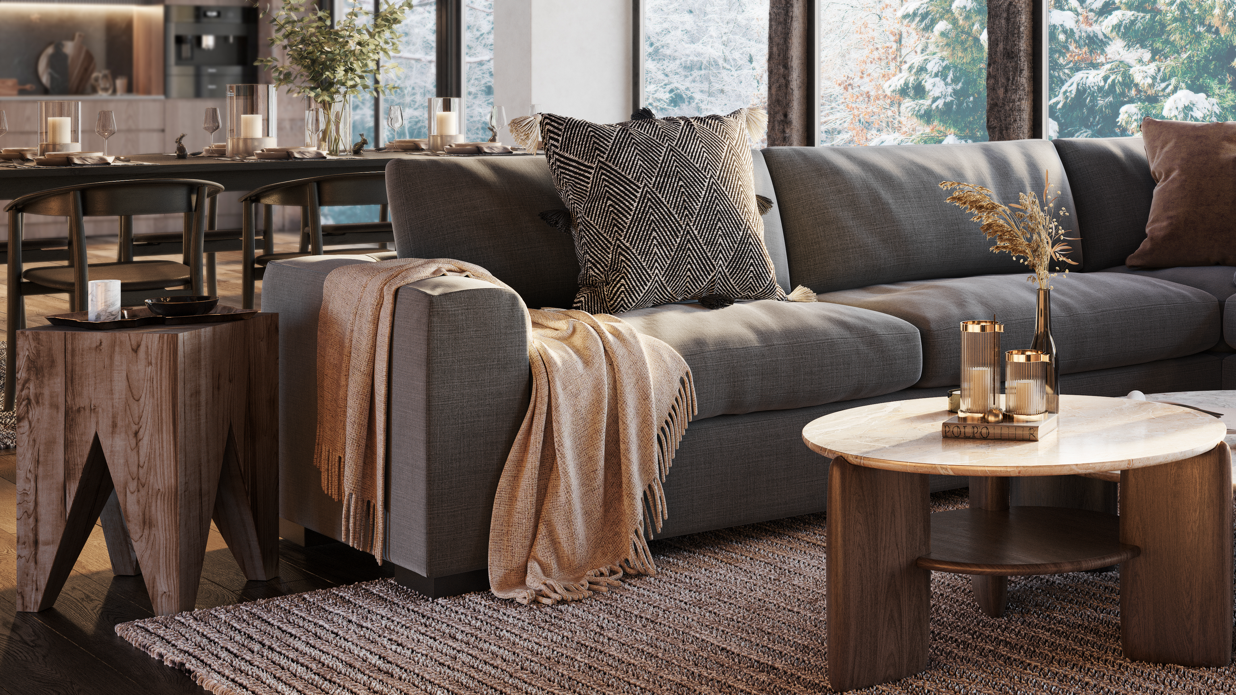
Interior detail — material texture and light interaction
Why Emotion Is Hard to Communicate Through Traditional Design Tools
The difficulty begins the moment a designer tries to share that emotional intent with someone else. Technical drawings communicate structure with precision: walls, openings, dimensions, relationships between spaces. They do what they are designed to do. What they cannot do is communicate the feeling of moving through those walls and openings — the compression before an opening releases into a generous room, the quality of silence that a particular ceiling height creates, the way diffused light from a north-facing window changes the temperature of a stone floor.
Material samples bring tactile information into the conversation, which is genuinely useful. A client who holds a piece of honed limestone understands its weight and surface response in a way that no photograph can fully replicate. But samples are experienced in isolation — under office light, against a neutral background, detached from every other surface they will eventually share a room with. They say nothing about how the stone will read when it meets the timber millwork twelve feet away, or when it catches the afternoon light that enters from the west.
Collected reference imagery fills in some of the atmospheric gaps, but it introduces its own interpretive problems. A photograph of a beautiful interior tells a client how a space with related qualities can feel — it does not tell them how their space, with its specific dimensions and light conditions and brief, will feel. Clients read those images through their own associations. Two people looking at the same reference photograph often take quite different things from it. What reads as calm restraint to a designer may read as cold emptiness to a client. What the designer means by warmth and what the client understands by warmth may not be the same thing at all, and references are rarely precise enough to resolve that ambiguity.
“Atmosphere is not a list of elements. It is what happens in the space between them — in the relationships of light, material, scale, and composition that no drawing or sample can fully anticipate.”
What People Actually Read in a Space
Before discussing how visualization helps, it is worth being specific about what creates emotional perception in an interior — because these are exactly the qualities that need to be communicated, and exactly the qualities that are hardest to abstract.
Light is the most powerful. Not just its presence or absence, but its quality: whether it is warm or cool, diffused or directional, whether it creates gradients across a surface or illuminates evenly, whether it emphasises texture or bleaches it away. A room with south-facing daylight in the afternoon reads entirely differently from the same room at dusk under warm ambient lighting. Both versions of the room are real, and both contribute to how the space is experienced and remembered. The emotional register shifts with the light.
Materiality shapes sensory realism. Wood grain suggests warmth and age. Stone implies permanence and weight. Plaster is soft and absorptive. Linen reads as relaxed and textured. A matte finish recedes; a reflective one advances. When surfaces are combined, they create a sensory conversation — a rough-textured wall beside smooth polished concrete, a dark timber ceiling above pale limewashed walls. The emotional character that emerges from those pairings is specific and deliberate, but it is only legible when you can see the surfaces in relationship to one another.
Scale and proportion shape comfort and plausibility in ways that are felt before they are understood. A room can be technically functional at ten feet of ceiling height and feel generous, or it can feel oppressively lofty. The scale of furniture relative to the room it occupies changes how the room feels to inhabit — whether it reads as carefully curated or randomly assembled. Composition creates focal points, guides the eye, establishes rhythm and balance. None of this can be read from a specification sheet, and none of it is visible in isolated samples or references.
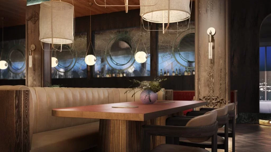
Interior render — light, texture, and material relationships defining spatial atmosphere
From Concept to Atmosphere
A design idea becomes emotionally coherent when all of its elements point in the same direction. This is not something that happens automatically. It requires the designer to hold a complex set of relationships in mind simultaneously — light conditions, material weight, spatial proportion, tonal palette, the sensory texture of surfaces — and to ensure that each decision reinforces the emotional intent rather than working against it.
In practice, this synthesis is one of the most demanding parts of the design process. A room that is meant to feel like deep calm requires not only pale materials and diffused light, but furniture with the right proportional weight, a ceiling treatment that does not introduce visual complexity, a floor surface that does not reflect too aggressively, an absence of competing focal points. Remove any one of those elements, or make a single choice that contradicts the emotional direction, and the atmosphere shifts. The room no longer feels settled.
Atmosphere is built from relationships rather than from individual elements. A beautiful material in the wrong context loses its beauty. A well-proportioned room with misaligned lighting can feel unsettled. The emotional character of a space is something that emerges from the coherence of all these relationships working together — and that coherence is almost impossible to evaluate when the elements are presented separately. It can only be read when they are assembled together in a spatial context.
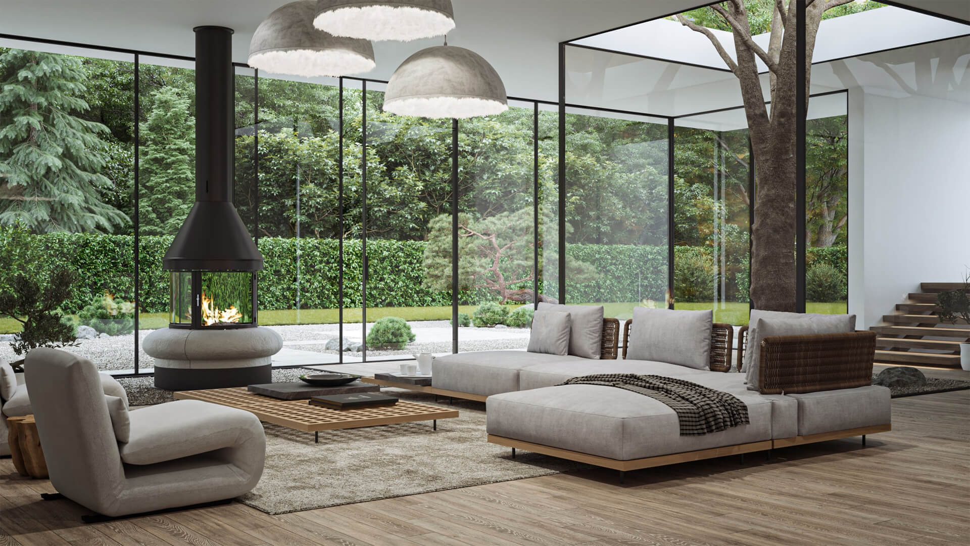
Three rendered variants — same space, distinct emotional atmospheres through material and light
Why Visualization Becomes the Missing Translation Layer
If the emotional character of a space is built from the relationship between light, materiality, scale, and composition — and if that character can only be read when those elements are assembled together — then the problem of communicating it before the space exists is fundamentally a problem of medium. The tools traditionally available to designers are not equipped to show assembled relationships. They show elements in sequence: drawings first, then samples, then references. The synthesis, the atmosphere, the feeling — that part the client is asked to imagine.
This is where the limitation becomes consequential. Clients who are being asked to make significant commitments — to finishes, to layouts, to lighting installations that are difficult to change after construction — are being asked to trust their imagination for the most important part of the evaluation. Some clients can make that leap. Many cannot, and the gap between what they approved and what they expected reveals itself only when the room is finished.
That is why many studios rely on interior visualization when they need to communicate not just layout and finishes, but the atmosphere, emotional tone, and sensory character of a future space. The rendered image does not replace the designer’s judgment — it extends it. It takes the synthesis of relationships that the designer has been holding in mind throughout the process and makes it visible to someone who cannot yet enter the room.
How Visualization Carries Emotion

Interior render — composition, focal point, and spatial emotional hierarchy
A well-made interior render communicates atmosphere through exactly the same cues that a physical room uses. Lighting is the most direct instrument: the colour temperature, the direction, the softness or sharpness of shadows, the way reflected light pools in the corners of a room — all of these signal emotional register before the eye has read a single material consciously. Warm raking light across a textured plaster wall creates a sense of time and habitation. Cool diffuse light reads as restraint and clarity. Candlelight warmth against shadow creates intimacy. These are not aesthetic choices made by the visualiser. They are translations of the designer’s original emotional intent.
Texture gives the image sensory credibility. The grain structure in a timber floor, the slight relief in a woven fabric, the granular depth of a honed stone surface — when these are rendered with accuracy, the room begins to feel inhabitable rather than diagrammatic. The viewer’s perceptual system responds to material information even in a still image, anticipating the weight, temperature, and softness that those surfaces would offer in reality.
Camera viewpoint shapes the emotional experience of the image itself. A low camera angle that looks across a seating area creates intimacy and immersion. A wider angle that shows the full depth of a room communicates openness and proportion. The choice of where to stand — and what to include and exclude from the frame — is a compositional decision that directly affects how the space is emotionally read. Designers who understand this use it deliberately.
Composition creates emotional hierarchy: where the eye enters the image, what it moves toward, what is given emphasis and what recedes. A single shaft of light on a focal wall. A considered asymmetry in the furniture arrangement. The negative space between a sofa and the window behind it. These are not decorative choices — they are the visual grammar of how the room communicates its character.
Why This Matters for Designers and Clients
When emotional intent is made visible, the conversation between designer and client changes in a specific and useful way. Feedback becomes more precise because clients are responding to something they can actually see rather than something they are attempting to imagine. Instead of expressing vague uncertainty — “I’m not sure it will feel right” — they can point to specific qualities. The light is cooler than I expected. The room looks more formal than I wanted. These are actionable responses that lead to genuine refinement rather than circular reassurance.
Design choices become easier to trust when they can be experienced visually rather than deduced from a specification. A client who has seen a rendered image of their future bedroom — with the exact materials, the specific lighting conditions, the proportional relationships of that particular room — is not being asked to take the design on faith. They have already, in some meaningful sense, been inside it. Their approval is grounded in something they have perceived, not only reviewed.
Misunderstandings of the kind that surface late in a project — after procurement, after installation, after the room is finished — tend to originate from that gap between what the designer intended and what the client understood. Visualization does not eliminate the possibility of misalignment, but it moves the conversation about alignment to an earlier stage, when differences of perception can be addressed without cost.
The Best Images Do Not Just Show a Room — They Convey a State of Mind
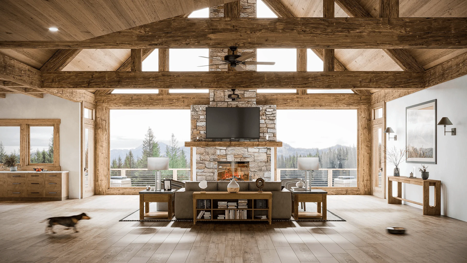
Interior render — emotional atmosphere, lived-in quality, and full spatial intent
There is a distinction between an interior image that documents a proposal and one that communicates it. The first shows what the room contains. The second allows the viewer to understand what the room means — how it might feel to enter it at a particular time of day, to sit in it, to return to it after a long day, to have it become the background of a significant part of a life.
The strongest interior images carry this second kind of meaning. They suggest not only what has been designed but why — what emotional intention is embedded in the choice of a particular material weight, a particular quality of light, a particular spatial rhythm. They make the designer’s synthesis visible rather than leaving it to be inferred. In that sense, they are not representations of a room. They are arguments for an emotional experience.
This is where visualization becomes part of design language rather than mere representation. When an image is capable of making someone feel the intention inside it — when it communicates calm or warmth or quiet intimacy or energetic openness with the kind of precision that the designer intended — it has done something that drawings and samples and references together could not. It has made the invisible visible before the first wall is touched.
Conclusion
Visualization matters because it helps preserve the emotional core of a design idea from concept to communication. The feeling that a designer begins with — the atmosphere they have been working toward through every material choice and spatial decision — is fragile. It can be lost in translation, misread by a client, diluted by revision cycles that were caused by misunderstanding rather than genuine disagreement.
A successful rendered image does not simply document a proposal. It allows someone else to feel the intention inside it. In doing so, it closes the distance between the designer’s vision and the client’s understanding — not by simplifying the idea, but by making it perceivable to someone who cannot yet stand inside the room.
That is what interior visualization, at its best, actually is: not a marketing tool, and not a technical deliverable. It is the medium through which emotional design intent finally becomes legible to the people who need to understand it most.