


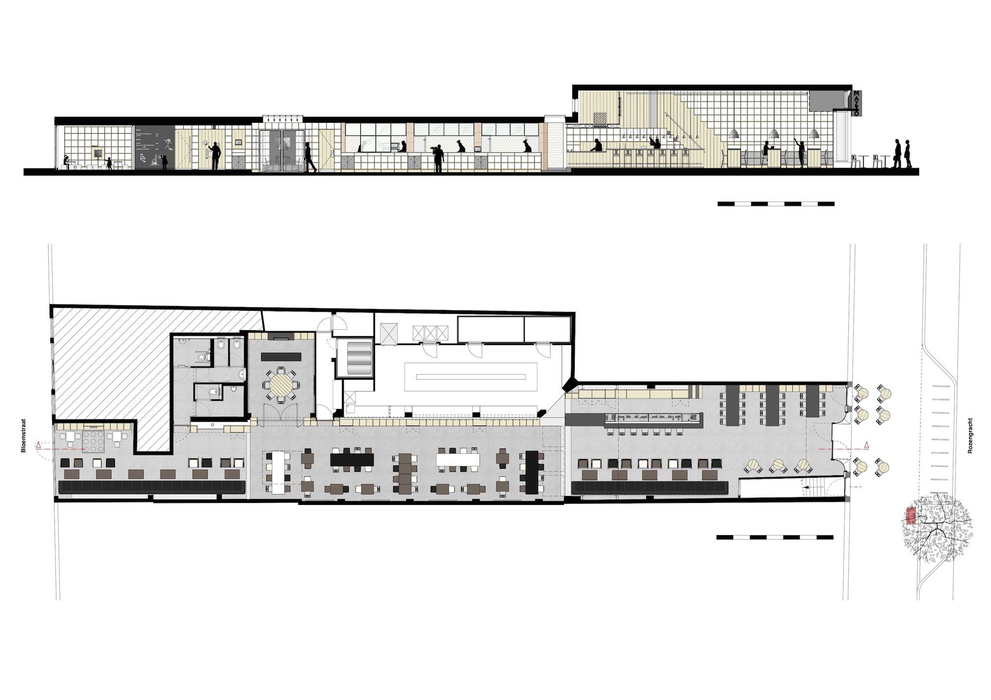
MAZZO designed by CONCRETE located in Amsterdam, The Netherlands
Project team: Rob Wagemans, Ulrike Lehner, Marc Brummelhuis, Sofie Ruytenberg (graphic design), Femke Zumbrink (graphic design), Rrik van Dillen Total area: 400 m2 Date: 24 october 2010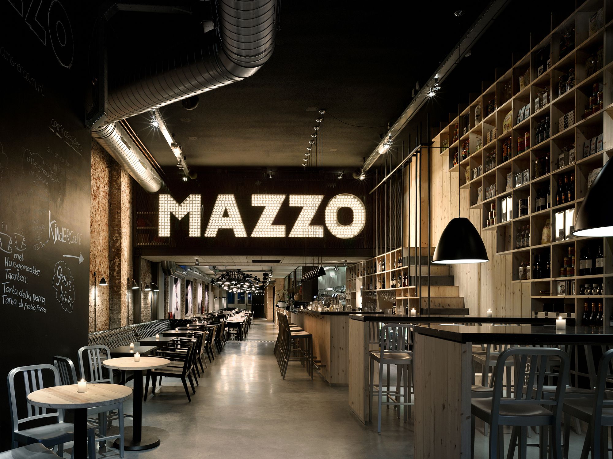 Manufacturers:
General contractor: Roord Binnenbouw, Amsterdam, Nl
Fixed furniture: Roord Binnenbouw, Amsterdam, Nl
Loose furniture: Satelliet, Amsterdam, Nl, Roord Binnenbouw, Amsterdam, Nl
Lighting: Bestlite by Gubi, Kopenhagen, Denmark, Moooi, Amsterdam, Nl, Wever&Ducre, Roeselare, Belgium
Metal constructions: Smederij van Rijn, Hazerswoude Rijndijk, Nl
Manufacturers:
General contractor: Roord Binnenbouw, Amsterdam, Nl
Fixed furniture: Roord Binnenbouw, Amsterdam, Nl
Loose furniture: Satelliet, Amsterdam, Nl, Roord Binnenbouw, Amsterdam, Nl
Lighting: Bestlite by Gubi, Kopenhagen, Denmark, Moooi, Amsterdam, Nl, Wever&Ducre, Roeselare, Belgium
Metal constructions: Smederij van Rijn, Hazerswoude Rijndijk, Nl


SHORT STORY INTERIOR
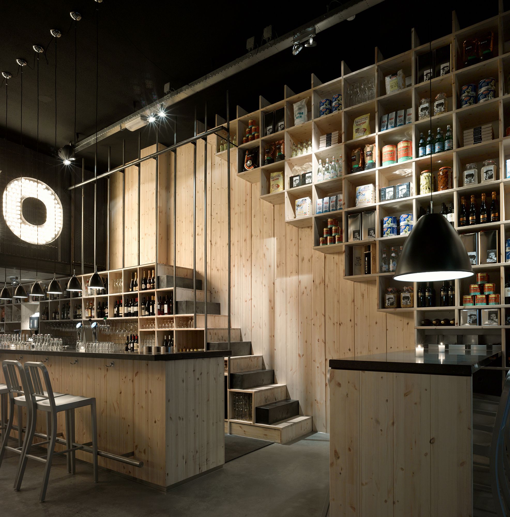
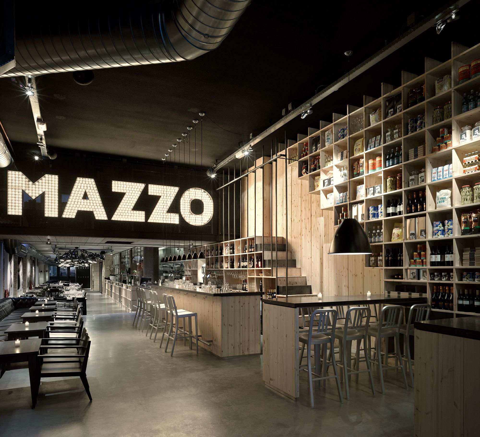
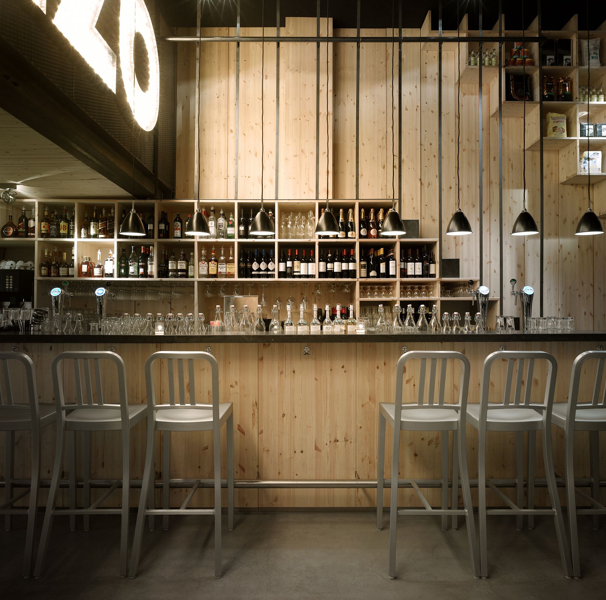
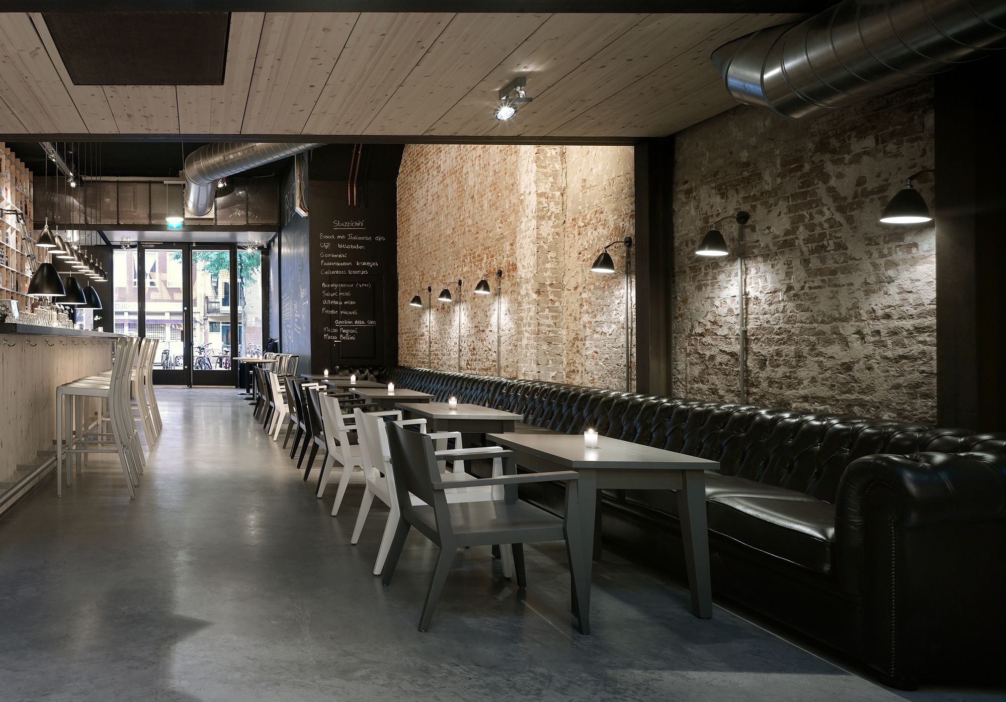
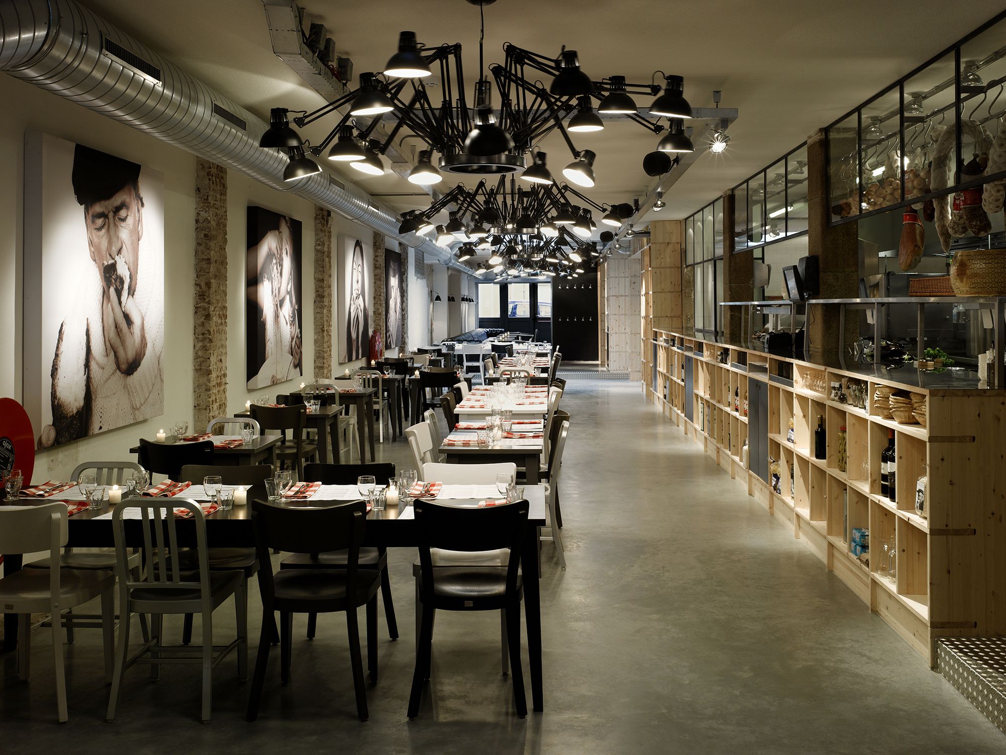
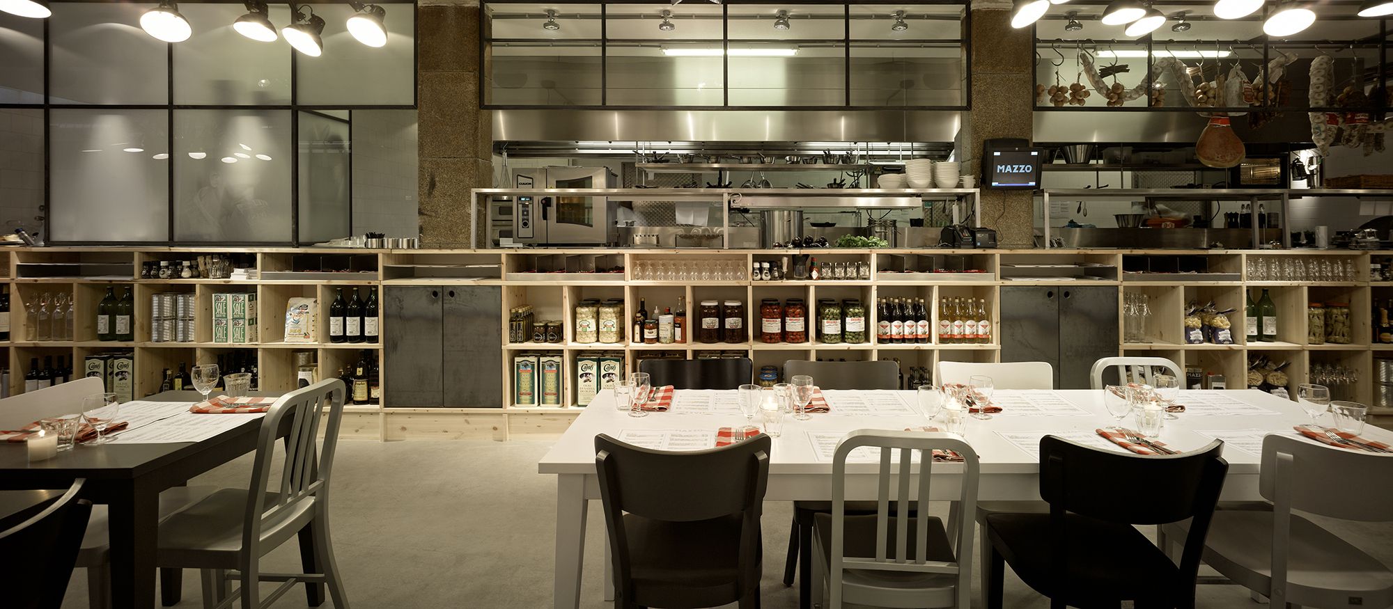
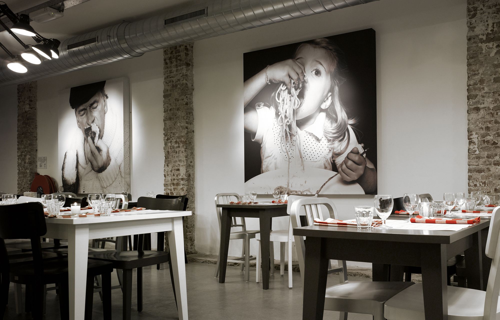
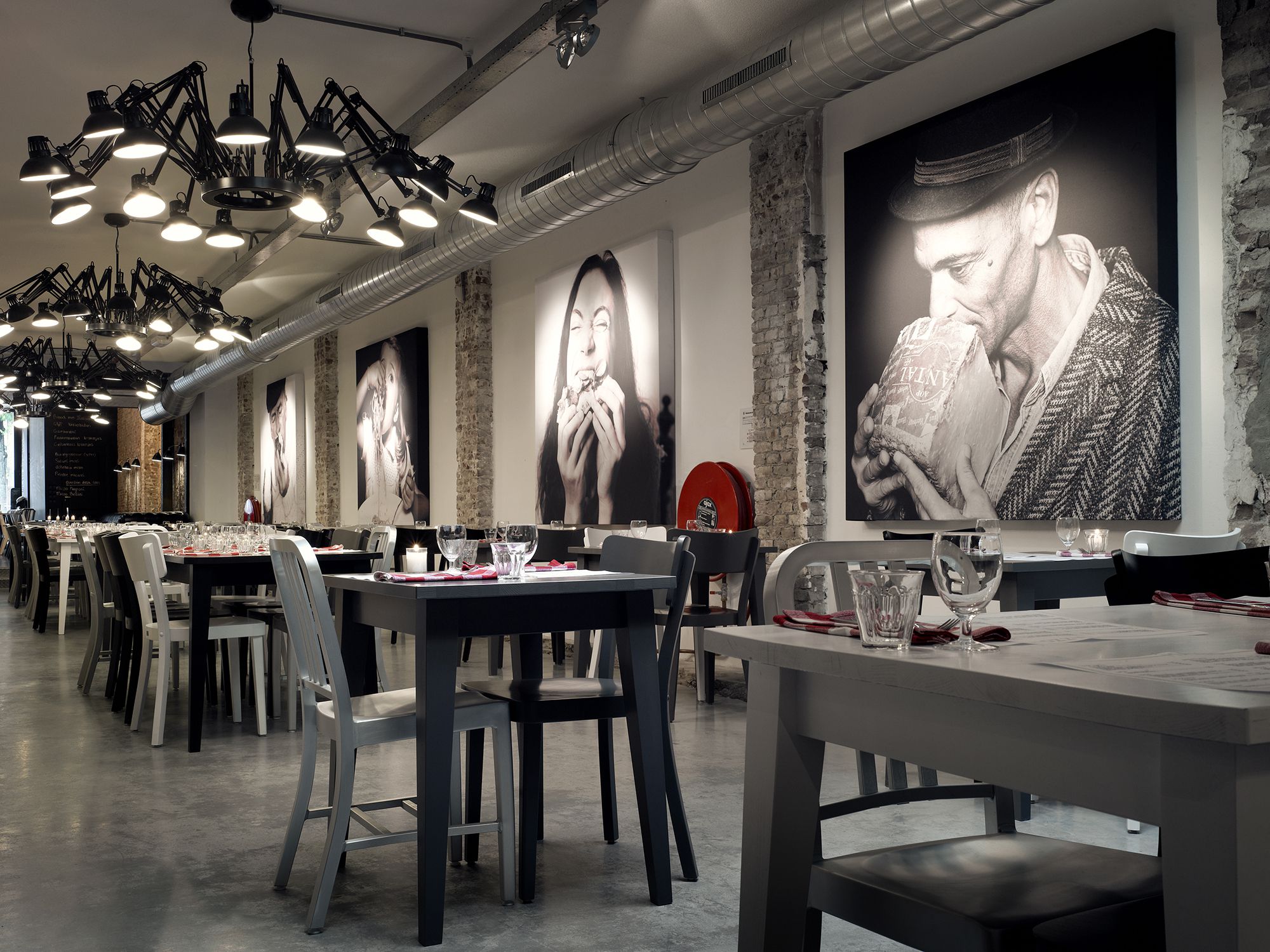
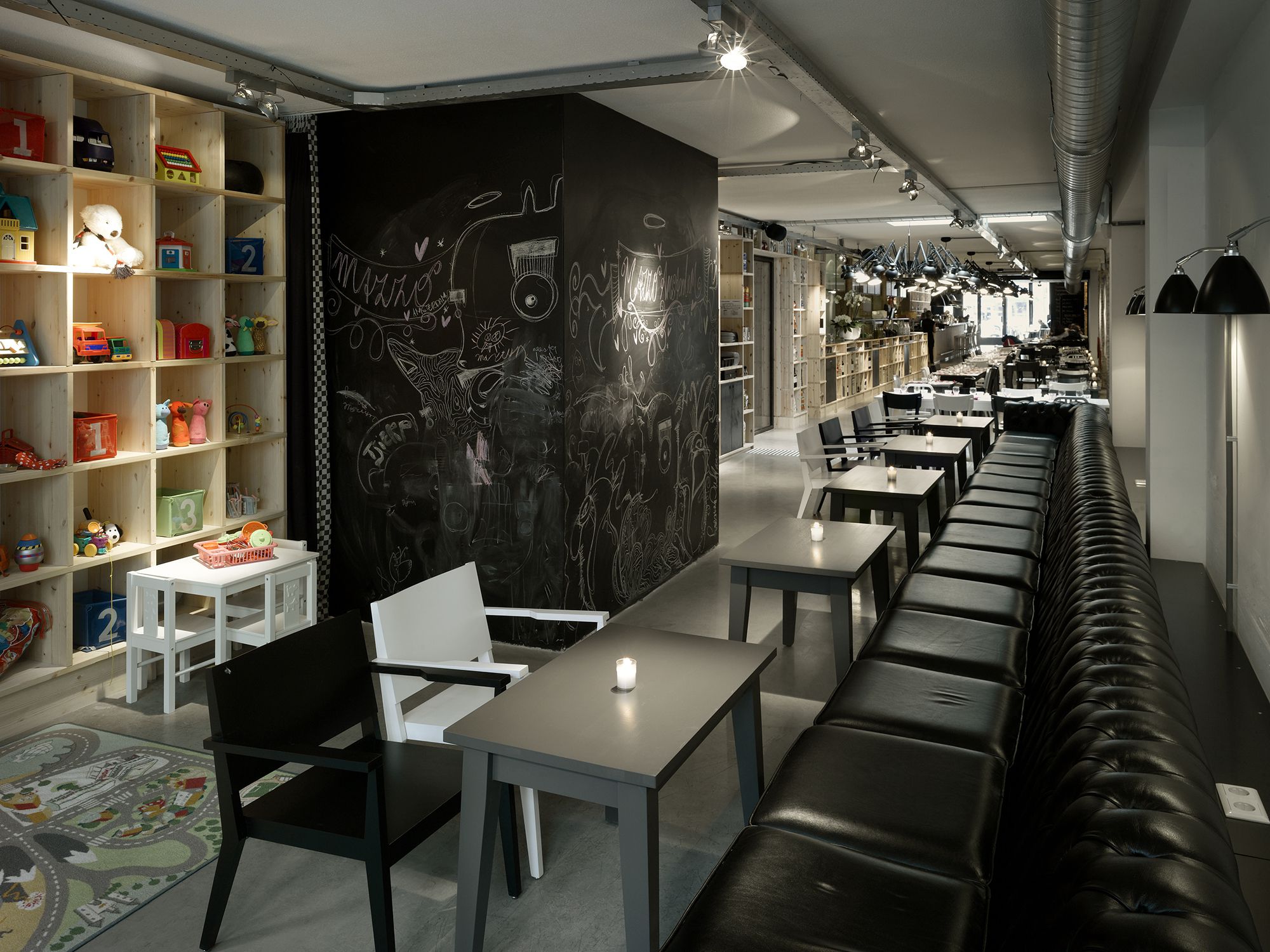
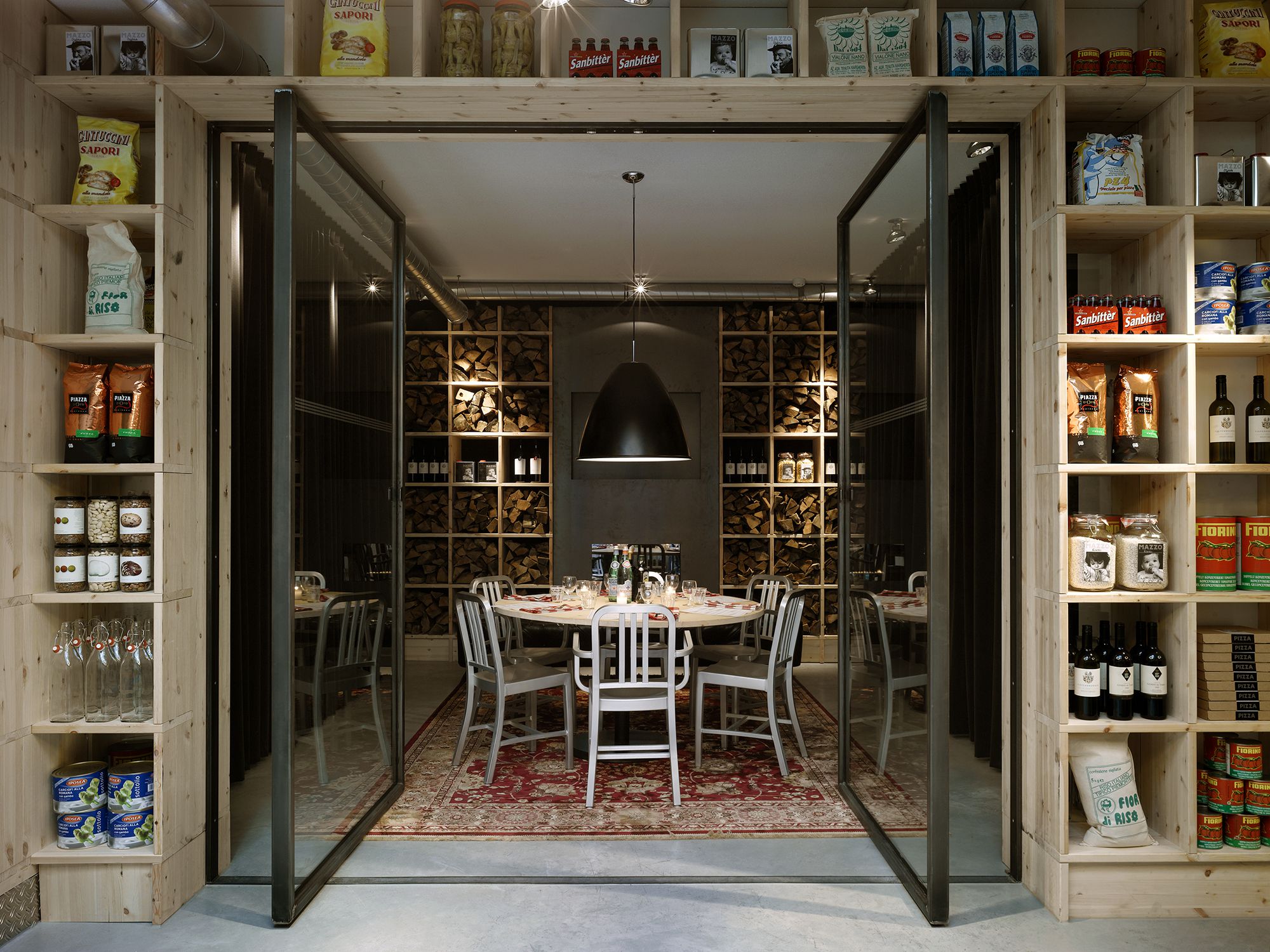
Mazzo, the eighth member of the IQ creative family in Amsterdam, is the Italian sister of Brasserie Witteveen – both in hospitality concept and in the interior there is an obvious connection. As with Witteveen the name and location of Mazzo share a history in the city of Amsterdam. Six years ago Mazzo was a famous and notorious disco in the monumental building on the Rozengracht. The building is typical in Amsterdam: narrow and very deep spaces fused together with different floor and ceiling levels, automatically providing a natural position for the restaurant. The first part, situated on the Rozengracht, has a five-meter high ceiling and faces directed outwards. The perfect area for a bar, where guests can order a fast espresso or have a drink at the high bar tables. Lighting from the Bestlite series by GUBI creates the intimacy in this space. The wall lights above the nine-meter chesterfield couch and the suspension lights above the bar and bar tables in xs and XL sizes create a living room ambiance. The second part is obviously lower but twice as wide. A few original stone columns divide this part into two zones. The darkest part of the entire building is perfect to house the kitchen. The ting area of the restaurant is opposite to the kitchen with a simple but flexible, trattoria-like table arrangement. A variation of tables for two or eight are placed and every table has a great view of the chefs in the kitchen. Five Dear Ingo lights by MOOOI comfortably light up the ting area. Independent of the table arrangement, these modern chandeliers give a pleasant and intimate light. Four portraits of people in different age categories provide an Italian family-feeling of which the guests can be a part during dinner. For a real family dinner or a business meeting guests can use the boardroom. A cosy room with a TV screen and fireplace, next to the kitchen, that can be closed off if privacy is preferred. The third part is orientated towards Bloemstraat. A narrowing in the building creates the small backroom where kids can play during the day under the watch of their parents. At night the toys can disappear in the cabinet behind a black-and-white blocked curtain and guests can retreat into the eleven-meter long chesterfield couch to enjoy a good glass of wine and have a nice conversation. Again the Bestlite wall lights by GUBI create a home-like feeling. The diversity of the fused spaces and the natural restaurant layout need a connecting element: a huge wooden cupboard across the whole restaurant linking all the spaces to each other and organising them at the same time. The cupboard, created out of solid pine wood for storage and display of the products, becomes the stairs to the mezzanine floor, the back bar, point of distribution for the food, the transparent division between the boardroom and restaurant, the wardrobe, the access to the restrooms and the storage for the kids toys. Five materials determine the ambiance of the raw and honest interior design: power floated concrete, chipped brickwork, stone, pinewood and raw steel. The first three materials are part of the shell of the building; all the new materials are steel and wood. The window frames in the cupboard and the mezzanine floor in the front of the restaurant are completely made of raw steel. The steel beams and columns are exposed and the extra floor is provided with an untreated expanded metal mesh. The use of honest and simple materials doesn’t distract the guests’ eye and underlines the fact that the restaurant focuses on the food. Embracing the past of the building and the name Mazzo by creating a logo that is a controversial part of the venue. The five letters are made of raw steel and filled with classic amusement lights, referring to the disco days of Mazzo. The light object crowns above the bar and will be noticed even in a flash by the cars and cyclists passing by.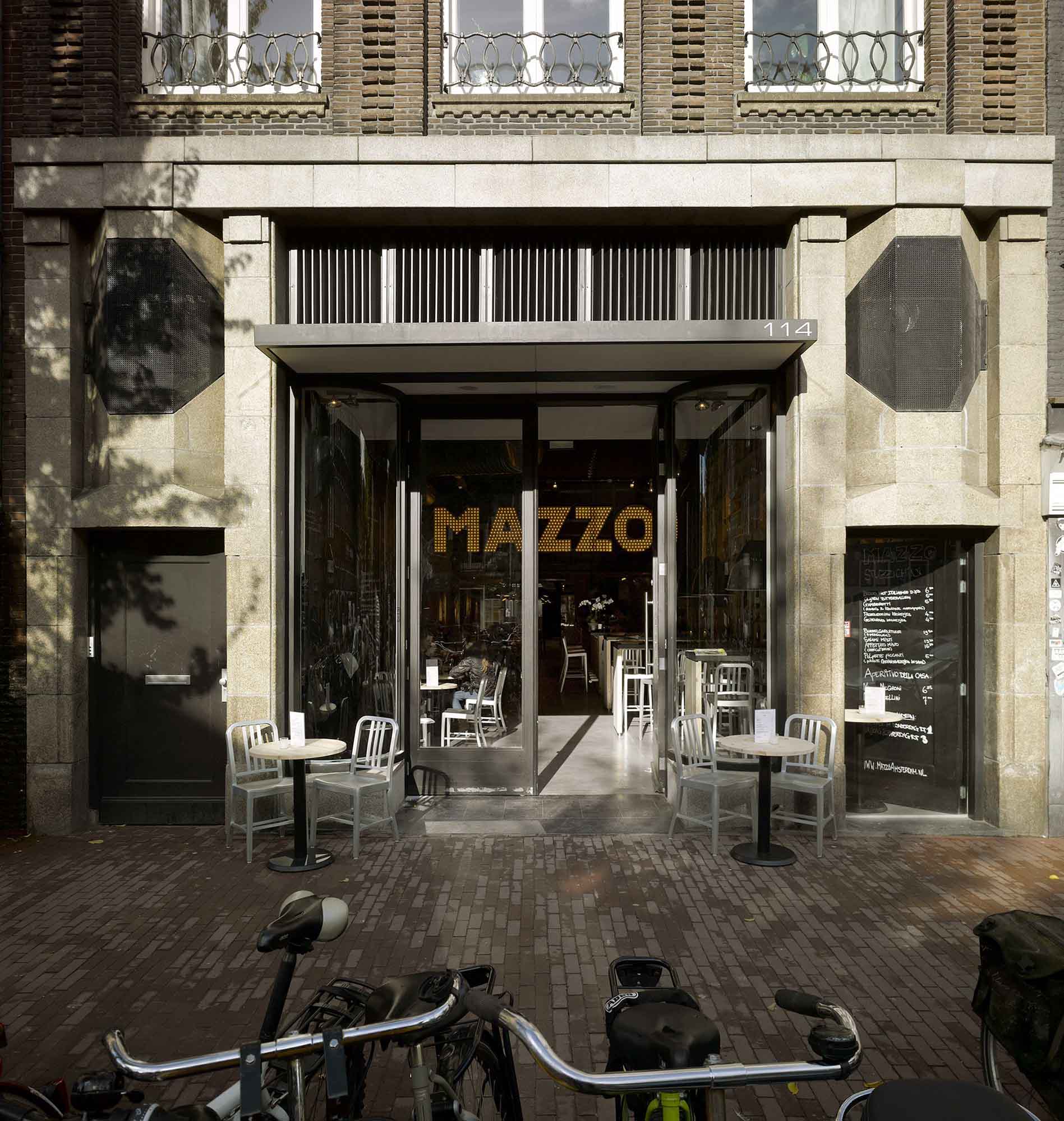
VISUAL IDENTITY The visual identity arises from the raw, honest interior and the characteristic, Italian cuisine. Using clear shapes, grids and high contrast black-and-white images, which is recognizable in all elements and expressions, creates a distinct graphic identity. The foundation of the Mazzo corporate identity is the Helvetica font, as every project within the IQ creative family. The font has been adjusted and given a characteristic interpretation. The letters are built up out of a pattern or grid of dots, referring to the short side of spaghetti. The logo is the template for the light object. The menu is structured as a brasserie menu: dynamic, quick to adapt, everything on one page and the menu functions as a placemat. Laid out in three columns, where the first two columns can be used for the dishes and the third column is reserved for ‘storytelling’ about the products used in the kitchen (olive oil, pasta, mozzarella and balsamic vinegar). Especially for the kids there is an adjusted menu on the connect-the-dots-placemat. The corporate identity is present in the interior through signing and window stickers. Cupboards The large, binding cupboard defines a great part of the ambiance of the restaurant and therefore plays an important part in the visual identity of Mazzo. The cupboard is filled with different products of Italian origin: bottles of wine, preserving jars with dried pasta, tin cans of tomatoes and bags of risotto rice. These products are spread from the front to the back throughout the whole restaurant. The characteristic portraits, used on the stickers and packaging of the products, create an Italian flair and complement the overall use of materials: raw and honest. Website The binding element in the restaurant, the cupboard filled with products, serves as the template for the Mazzo website. As the controversial floor has modelled for the website of Witteveen. Canvasses Four large portraits hang on the wall in the ting area of the restaurant. The portraits contain charismatic people in different age categories that show their passion for food varying from honesty, pureness and experience. These images contribute to the authentic and pure identity of Mazzo.
 Materials:
Floor: power floated concrete
Walls: -cupboard, solid pinewood
– brickwork
– plastered and painted, white
– plastered and painted, black, school board paint
– curtains, trevira CS Velours, KOBE
Ceiling: painted, white and black
Materials:
Floor: power floated concrete
Walls: -cupboard, solid pinewood
– brickwork
– plastered and painted, white
– plastered and painted, black, school board paint
– curtains, trevira CS Velours, KOBE
Ceiling: painted, white and black
Photos courtesy of Ewout Huibers for Concrete, drawings Concrete.

